Three Key Email Tips to Amp Up Accessibility and Prevent Pitfalls
By Teresia Sjödin
Global Communication Designer, L-Soft
Let's face it, we've all received an email that was a bit messy. Maybe the images didn't load properly, or the unsubscribe link was hidden somewhere in the fine print. As an email communicator or marketer, it's important to make sure that your emails are effective, accessible and compliant. In this article, we'll go over some important, yet often overlooked, best practices for your email messages.
Plain Text Alternative
First, say hello to one of the newest features of LISTSERV Maestro – the magic wand that eliminates the hassle of creating plain text versions of your email messages. LISTSERV Maestro now automatically generates a plain text alternative from the content of the HTML part, ensuring that all of your subscribers can read your messages, regardless of their email settings and devices. Plain text is the simplest form of content that contains no design elements, such as bold or italicized text, colors or images.
Despite the rise of eye-catching email designs, plain text parts are still an important part of any email marketing strategy and offer several benefits that should not be overlooked.
Why Plain Text Parts Are Still Important
- HTML messages with a plain text alternative generally offer higher deliverability and are less likely to be flagged as spam
- Screen readers may yield better results if a plain text alternative is used in conjunction with the HTML
- Alternative reading devices such as smart watches often use the plain text alternative
- Some people still prefer plain text messages and view HTML messages as a privacy risk
|

Alt text is like a descriptive whisper in the ear of your subscribers, painting a picture of your images.
Alt Text
You might be thinking, "Alt what?" Alt text, short for alternative text, is the text that appears when images don't load properly or for people who use screen readers due to visual impairments. Alternative text is an important part of HTML messages – especially in an era where most email clients no longer automatically load images for privacy reasons – because they allow the viewer to see what the images are supposed to show before enabling them.
Tips to Make Your Alt Text Effective
- Use descriptive keywords that are relevant to the image
- Avoid redundant or generic text
- Include important details, such as a call-to-action or product feature
- Use bullet points or short paragraphs for longer descriptions
|
Example 1: "Panoramic view of the historic district of Gamla Stan in Stockholm, Sweden"
The alt text accurately describes the image and provides relevant information about its location. It's also concise and easy to understand, which is important for people who use screen readers or have other accessibility requirements.
The description may be somewhat generic, but it's still specific to the image that it describes, providing relevant information about the location and content of the image.
Example 2: "Experience the charm of Stockholm: Marvel at the picturesque cityscape and historic Gamla Stan - Visit Now!"
This alt text not only provides a unique and engaging description of the image that highlights the charm and beauty of Stockholm, but it also includes a call-to-action to encourage people to visit the city. The alt text is still descriptive and informative, but it goes beyond a general description to create interest and spur action.
While there is no maximum number of characters allowed for alt text, you should keep it somewhat concise and limit it to 125-150 characters, including spaces and punctuation.
Note that alt text and the plain text alternative work hand in hand. From this example, LISTSERV Maestro would automatically generate a plain text part that looks like this:
|
Experience the charm of Stockholm: Marvel at the picturesque cityscape and historic Gamla Stan - Visit Now!:
<”[Image Download URL]”>
|
The image download URL is created automatically by LISTSERV Maestro, so you can see how many recipients clicked to open the image from the automatically generated plain text alternative.
Unsubscribe Link
We know it's hard to say goodbye. But sometimes people don't want to receive any more emails from your company. Maybe they feel overwhelmed or just aren't interested anymore. It's best to give them the opportunity to unsubscribe at their leisure because it allows you to focus on those subscribers who are truly interested in your messages. This way, you can improve your opens, clicks and conversions while maintaining a positive and respectful relationship with your audience. This is where unsubscribe links come into play. Not only do they ensure that you comply with laws and regulations, but they also show that you respect your subscribers' preferences and want to provide them with a positive user experience.
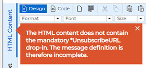
With LISTSERV Maestro 11.0, the unsubscribe URL is now mandatory by default to ensure that you're compliant with all global regulations.
Tips to Make Your Unsubscribe Link Effective
- Provide clear instructions on how to unsubscribe
- Make sure that the unsubscribe link or button is easy to find
- Avoid negative or guilt-inducing wording
- Make sure that you process all unsubscribe requests immediately
|
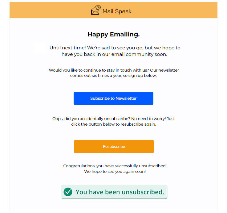
The unsubscribe link or button should be clearly visible and easily accessible in the email. It could be placed at the bottom of the email or in the footer. Clicking on the unsubscribe link should take the user to a page where they can confirm their decision to unsubscribe.
This confirmation page should include a message giving users the option to stay subscribed if they change their mind. Once the user has confirmed their decision to unsubscribe, they should receive a confirmation email informing them that they have been unsubscribed. Finally, the user's email address should be removed from the email list immediately to ensure that they don't receive any further email messages.
We should remember that email marketing is a powerful tool that should be used wisely and carefully. Including a plain text alternative, alt text and easy unsubscribe options in your email strategy not only demonstrates your commitment to accessibility and user preferences but also fosters trust and respect from your audience.
LISTSERV is a registered trademark licensed to L-Soft international, Inc.
See Guidelines for Proper Usage of the LISTSERV Trademark for more details.
All other trademarks, both marked and unmarked, are the property of their respective owners.


